Science 122

Laboratory

The Best Fit or Regression Line


How to draw the best fit line. Return to lab 6


In this lab you will need to determine whether or not a graph expresses a linear relationship. To do this you must draw what is known as a "best fit" straight line, also called a "regression line".

The purpose of the graph is to visually display relationships which may not be apparent from data tables. Experimental errors which are always present may obscure the relationships. The best fit line averages out the errors.

There are ways of calculating a regression line. You can find the formula in any statistics text. Most of the time an "eyeball" line will suffice. Many computer graphing software programs such as Excel will draw a regression line for you. The software will quickly draw the line and calculate its slope, intercept, and regression coefficient.

The regression coefficient is used to determine how nearly the points fall on a straight line, or how nearly linear they are. A perfect correlation will have a regression coefficient of R = 1.000 . . . Normally in the physical sciences we would like to have a "confidence level' of 0.01 or better. That means that a coefficient of R = .990 or higher gives us the confidence to say that a relationship is linear within a margin of tolerable error.

Without computer software you will need to draw the lines "by hand" and then make a judgement about whether the points are "linear". This judgement depends upon the nature of the experiment and how far you are willing to go in saying the relationship is linear. In other words, "how close is close enough"? The answer depends on your confidence and your judgement.

Here are two examples of graphs. The regression line has been drawn for each by the computer, but the regression coefficients have been left out for now. Clicking on the graph will give a full set of statistics for each graph so you can see how the numbers relate to your own judgement.

Graph 1. Distance vs. Time for Freefall

d vs. t graph

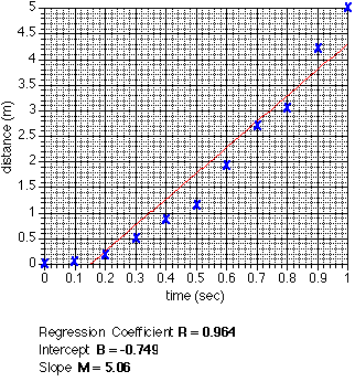
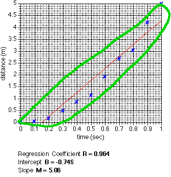
The regression line is the "best fit" straight line. As this graph shows it is possible to draw a line even when the data is obviously not linear. Notice how far some of the points are from the line. In fact this is a parabola and indicates a second power relationship.

Click on the graph to see the graph with the statistics.

Graph 2. Distance vs. Time Squared for Freefall

d vs. t^2 graph

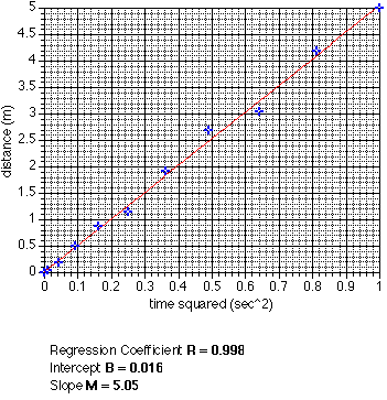
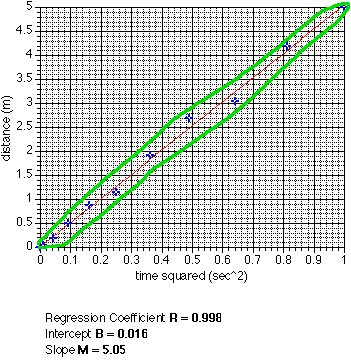
Again the regression line is the best fit. Here the relationship is clearly linear although some of the points are not on the line.

Click on the graph to see the graph with the statistics.


How To Draw the "Best Fit Line"

The easiest way to draw the best fit line is to enter the data into the computer and let the software do the work. If you don't have the software or don't know how to use it you can still estimate the regression line.

Imagine that the points enclose an area, then cut that area in half. If you use a ruler to draw the line you can move it around until you find a place where approximately half the points are on each side of the line.

Here is the d vs. t graph with the imaginary area outlined.

The more linear the data, the narrower the area and the easier it is to draw the line. Here is the d vs. t2 graph with the imaginary area outlined.

d vs. t^2 how to

Once the regression line has been drawn, use it (not individual points) to calculate the slope.


Here is a geometric way of visualizing how the best-fit line is calculated.

Return to lab 6